Ivan Chermayeff
Ivan Chermayeff grew up in a family of architects and artists; his father Serge Chermayeff was a Russian born, British architect and co-founder of several architectural societies, including the American Society of Planners and Architects. His brother, Peter, is a prominent architect.
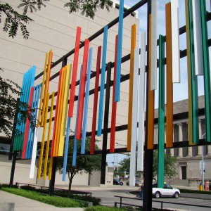
Ivan Chermayeff, called a “environmental pioneer,” is a prominent graphic designer who studied at many noted schools including Harvard University, the Institute of Design, Illinois Institute of Technology, and the Yale University School of Design. Chermayeff has been trustee and committee member for the Painting and Sculpture, Film and Design Departments of the Museum of Modern Art; a Vice President of the Yale Arts Association, Member of the Committee of Arts and Architecture, Yale University Council and a member of the Committee for Visual and Environmental Arts, Harvard University, Board of Overseers. His important art commissions include Exploding Triangles (Shaped canvases) for IBM Data Processing Headquarters; Dimensional Abstractions (plastic laminate wall construction) for the Bartholomew Consolidated School Corporation; Abstraction I (Aubusson Tapestry) for Westinghouse Electric Corporation; Abstraction II and III for Philip Morris; and Construction (wall with painted steel components) for the American Republic Insurance Company. Chermayeff was commissioned by the Department of General Services, New York to create a blue painted steel concrete sculpture for the 49th Police Precinct, as well as an abstract fiber banner for Family Court. His “Tiles of the Oceans” for Aquaria de Lisbon, Lisbon, Portugal is a tile mural some five stories high graces the most visible side of the Lisbon Aquarium. From a distance it appears to depict almost photographic images of marine life. Viewed close-up, the images dissolve, becoming an abstract tapestry of classic Portuguese ceramic tile patterns.Chermayeff, whose work garnered a string of laurels, also designed posters, created museum and gallery displays and illustrated children’s books.
Away from the office he was known for making collages in which he cheerfully married strange bedfellows (buttons and boot jacks, work gloves and pebbles, airline luggage tags and canceled stamps) as if to counter the cool minimalism of his 9-to-5 life. His art in a variety of mediums has been exhibited around the world.
Chermayeff’s philosophy of corporate design was as simple as the design itself: A logo, he often said, should be clean, crisp and instantly comprehensible.
“It is usually a two-month process to get to that point,” he explained in a 2015 interview, “but it should look like it took five minutes.”
For Chermayeff, the results included the Showtime logo, with “Sho” in white on a red circle; HarperCollins’s stylized red flame atop a stylized blue sea; and the Smithsonian’s vivid yellow sun, encircled by blue.
He loved lettering in all its myriad forms, and one of his most arresting graphic works is one in which he tore a letter asunder. For its Sept. 16, 2001, issue, The New York Times commissioned an illustration from Chermayeff to accompany an Op-Ed article about the Sept. 11 attacks.
The design he created is as simple as an illustration can get: just two letters, “U.S.,” in bold black type. But in the finished image, Mr. Chermayeff has wrenched the “U” from its moorings, leaving two jagged stumps where the letter once was. The result is wrenching to see.